
No, we’re not actually talking about cattle today, unfortunately—or marketing, for that matter. In the library context, a brand is a personal mark a reader puts on the inside cover of a book. Normally I wouldn’t advocate defacing the collection in this way, but there’s a pretty good reason for the practice.
When you read heavily in a specific area, like some do—we’re talking two or three books a week or more—remembering which books you’ve already read can get tricky. For a series like Sue Grafton’s Alphabet mysteries, this isn’t a problem. However, delineating Louis L’Amour’s extensive bibliography, with Riders of the High Rock, Rider of the Ruby Hills, Riders of the Dawn, Ride the River, and Man Riding West (Okay, we get it, Louis!) can get understandably difficult.
Book brands, then, allow a reader to make sure that they haven’t read a book before checking it out. Think of it like a very low-tech version of Goodreads.
Branding encompasses more than just utility, though. Each mark reflects its own bit of personality and artistic flair of the reader. These designs of ink and graphite form a permanent connection;not only are they mnemonic, but also meaningful. “I was here” is a powerful statement, and one not just reserved for carving into the walls of National Park picnic tables.
I admit that I might be romanticizing things, but nonetheless, I decided to keep track of some of the brands I came across. I mostly focused on the highly branded collections of Westerns and Inspirational large print, though they’re also found throughout all the different sections.
Here are my findings:
Roughly 67 uniquely-identifiable brands exist at this time.
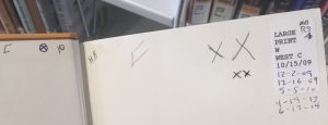
Lawless Prairie by Charles G. West is the most-branded title I found, sporting a whopping 10 different brands.
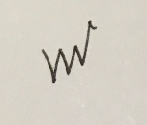
The most prolific brander is far and away Big Squiggle. I stopped counting their brands after 125 instances— all in all, they’ve probably branded close to 200 books. Whoever you are, Big Squiggle, you amaze me.
Little X is the runner up, with about 70 instances, though this is likely a collective brand—which greatly reduces its effectiveness, I would think.
This one is rather subjective, but the coolest brand, in my opinion, is the X-Men Logo. I like to imagine that this person is actually a huge fan of both The X-Men and Western novels. Also, it looks an awful lot like an actual cattle brand, which is neat.
Other interesting brands, described to the best of my ability, include Red Ink Asterisks, Double X, Underlined OG, @, Little Hat, Post-Modern Tulip Drawing, what appears to be “Ewe” (like a female sheep?), and Tilted Z with Two Dashes. Initials, numbers, and various swooping letters make up the rest of the brands.
I like to wonder about this community of branders. Does Big Check Mark open up a book, see Little Double X’s mark, and decide it’s probably a good one? Or conversely, maybe they don’t want to follow in the footsteps of another. Maybe they’re just ships passing in the night, all interacting on the same twenty-year old page of yellowed paper, each staking out their patch of the previously blank space.
-Eli Hoelscher is a Readers’ Services Assistant at Lawrence Public Library.

Add a comment to: Branding is Everything, Even in the Westerns